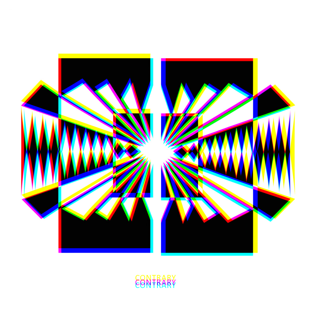
“Contrary” is a captivating geometric abstract piece that explores the interplay of shapes and colours in a visually striking composition. The canvas is adorned with an array of angular shapes and lines, creating a dynamic and intricate visual landscape.
The dominant black and white elements serve as a foundation, providing a stark contrast against the vibrant hues of red, yellow, green, cyan, blue, and magenta. At first glance, the colours might seem randomly distributed, inviting the viewer to delve deeper into the artwork’s hidden secrets.
Upon closer inspection, it becomes apparent that every pixel has been meticulously placed. The precision becomes evident when the piece is observed through a prism at the correct focal point and viewing angle. What initially appeared as a kaleidoscope of colours transforms into a revelation of hidden patterns.
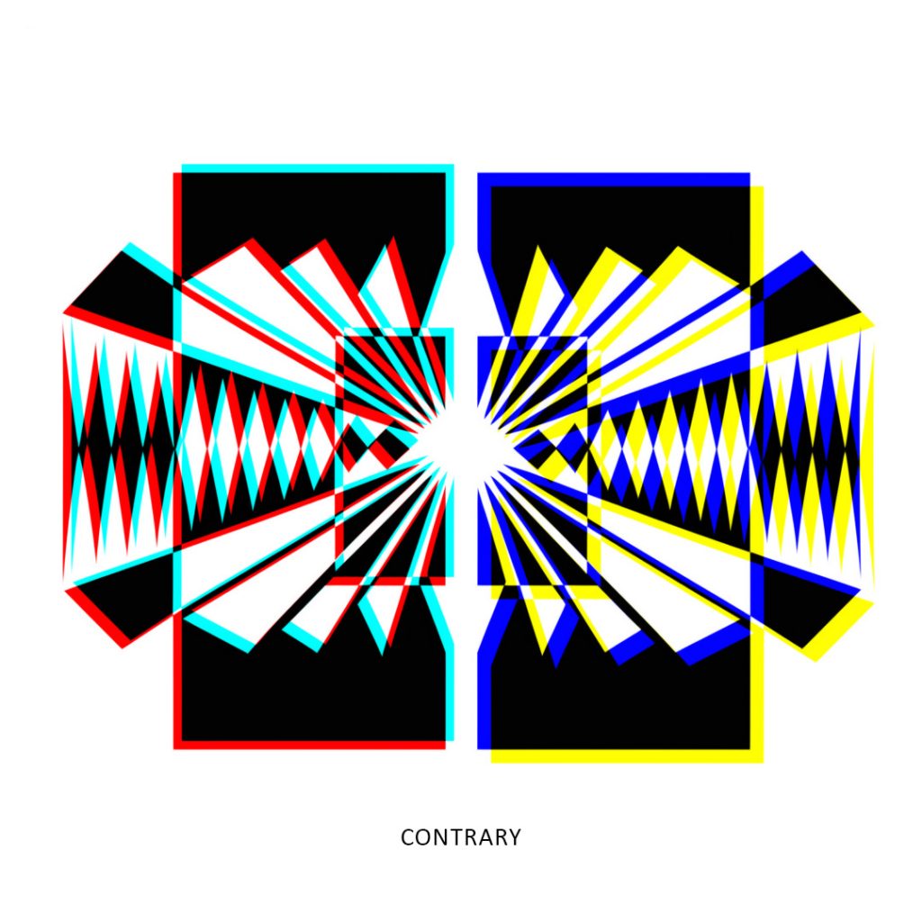
When viewed through the prism, the graphic undergoes a mesmerizing transformation. The colour palette on the left reduces to a harmonious blend of red and cyan, while simultaneously, the right side transitions to a captivating interplay of blue and yellow, as illustrated in the graphic below.
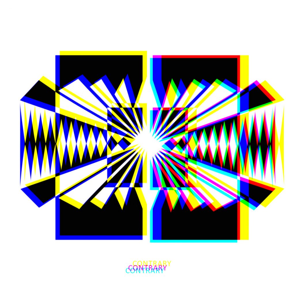
The intrigue deepens as the observer interacts with the artwork through the prism’s rotation. A 90-degree counter-clockwise turn positions the prism vertically, causing the left side to shift from cyan and red to blue and yellow.
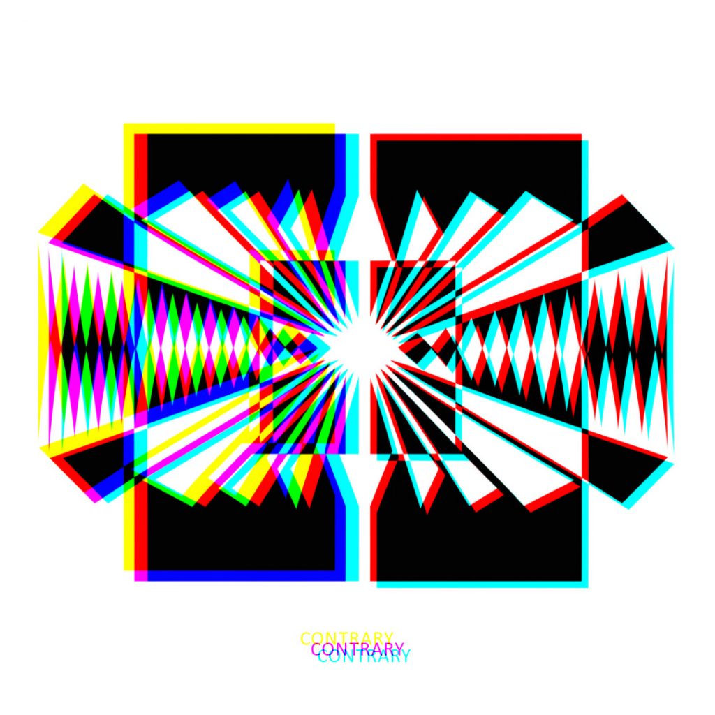
Conversely, a 90-degree clockwise rotation transforms the right side from blue and yellow to cyan and red as shown in the graphic below.
This unique play with colour dynamics challenges conventional perceptions, leaving the viewer in a state of wonderment. The transitions may appear contrary to traditional expectations of colour theory, inviting contemplation and sparking curiosity about the intricacies of visual perception.
“Contrary” not only captivates the eye with its bold geometric forms and vibrant colour palette but also engages the viewer in an interactive exploration of colour relationships. It is a testament to the artist’s meticulous craftsmanship and a celebration of the unexpected beauty that emerges when form and colour collide in harmony.