One image. Two outcomes.
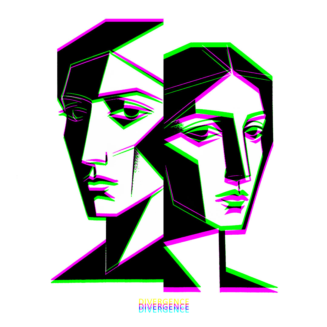
Divergence is a prism-reveal portrait artwork that changes in your hands: what begins as black-and-white geometry with magenta/green edge offsets resolves at the correct focal point, into a second, hidden colour logic.
At first glance, Divergence reads as a crisp, graphic diptych: two stylised faces built from sharp planes of black and white, edged by deliberate magenta and green misregistration. It looks like a visual “glitch” until you realise it’s engineered.
This artwork is designed around divergent colour shifts. On the left, the magenta sits high while the green falls low; on the right, that relationship flips. The result is a quiet tension at the edges — a disagreement that’s deliberate, measured, and repeatable.
Viewed through a prism at the correct focal point, those offsets reorganise into a revealed composition as shown below:
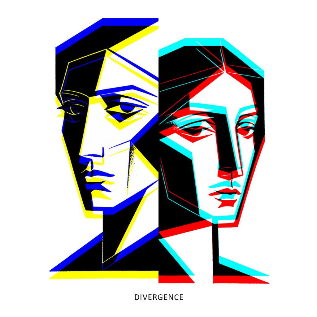
- Left portrait shifts into blue & yellow offsets
- Right portrait resolves into cyan/red offsets
The faces remain the same, but the palette changes. Like two perspectives emerging from one shared outline. Divergence is about difference without distance: two figures, one structure, and a split in the way light decides to agree.
What makes it unique
- Prism-reveal design (not a filter): the colour behaviour is constructed, not accidental.
- Two different reveals in one piece: left and right resolve into different complementary outcomes.
- A signature process: controlled, intentional channel displacement that creates a focal “snap” into the hidden palette.