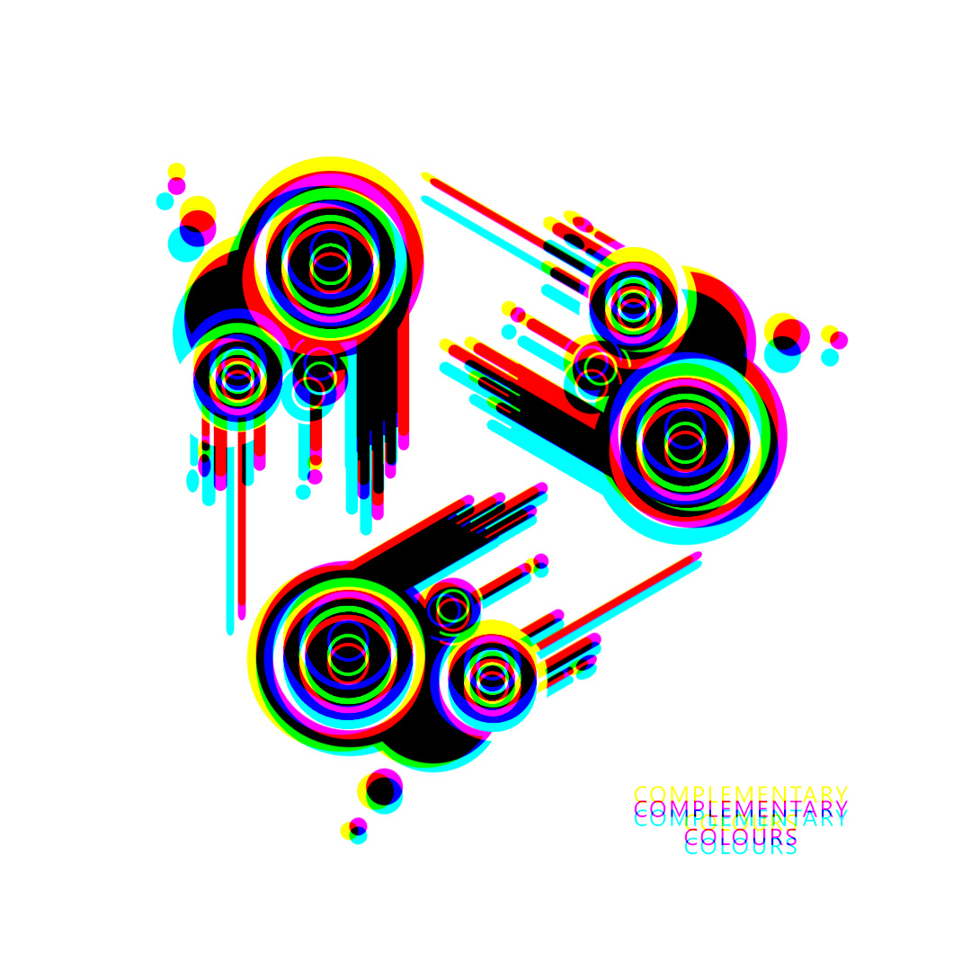
Behold, a digital masterpiece that harnesses the power of light and prisms to create a visual feast for the eyes! This artwork features three shapes, each with its own kaleidoscope of color and light, drawing the viewer in and captivating their attention.
But that’s not all – when viewed through a prism at the correct focal point, these objects take on a whole new life. The refraction of light through the prism causes the colors to shift and blend in fascinating ways, revealing hidden patterns and combinations. Below is what the image above would look like when viewed through a prism.
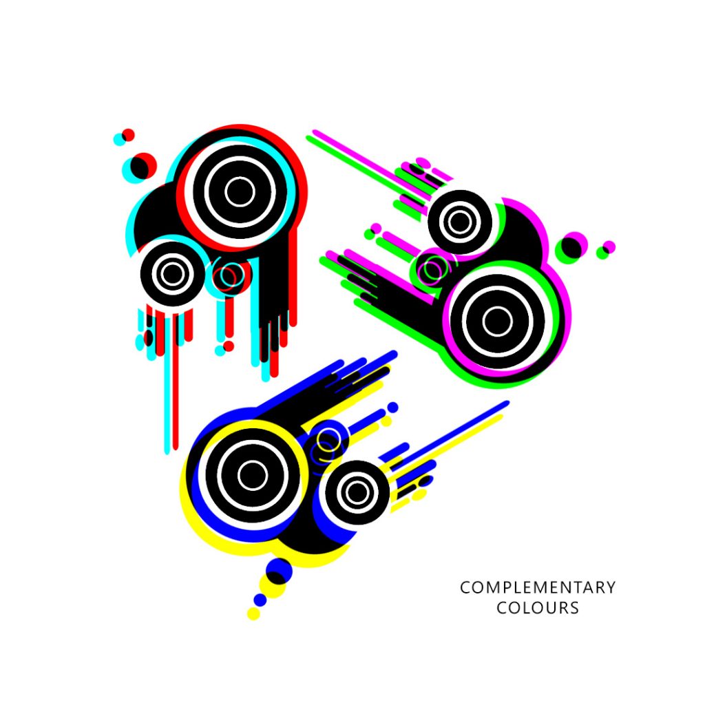
As the colours are shifted, the colours on the top left have all been shifted to a bold pairing of red and cyan, creating a sense of energy and vibrancy that leaps off the screen. The second is object has a soothing blend of green and magenta, evoking feelings of tranquility and peace. Finally, the third object is a striking combination of yellow and blue, with the colors blending and morphing together in a hypnotic dance.
These colour combinations are complimentary colours.
Did you also notice that the rings inside each of the objects have turned black and white?
This artwork is a testament to the beauty and power of light, and a celebration of the endless possibilities of digital art. It is a true masterpiece that invites the viewer to explore and discover new wonders with every glance.