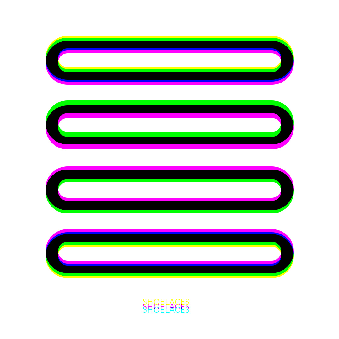
Shoelaces looks straightforward at first: crisp black on white, with a few deliberate hits of colour that seem almost too subtle to matter. Bright offsets that feel like a printing error you’d normally correct. It’s calm, minimal, and very controlled… until you view it through a prism..
Through the prism, the whole piece snaps into a different logic. As shown below, the top two “laces” resolve into cyan and red, while the bottom two flip into blue and yellow — as if the artwork is running two separate colour rules at once. It doesn’t read like a simple tint shift; it feels like the image is reorganising itself. The same geometry stays put, but the colour relationships rewrite. You’re left with that immediate, honest reaction: How is this even possible?
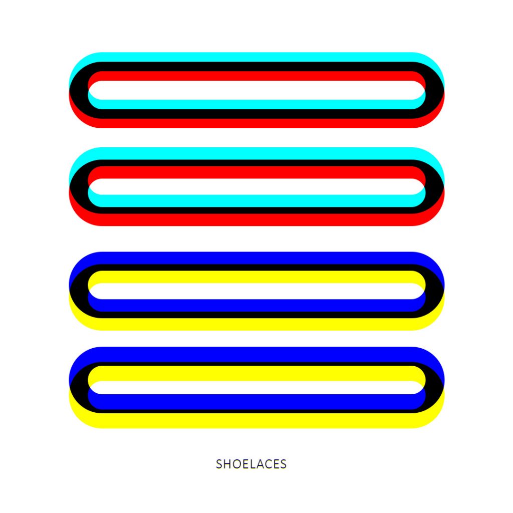
That’s the paradox the piece leans on: simple design, complex results. The shapes are deliberately uncomplicated so your brain can’t blame the effect on detail or texture. With nothing to hide behind, the colour behaviour becomes the subject. The laces start behaving like a controlled experiment — identical forms, different outcomes. The top pair becomes a cyan/red system, the bottom pair becomes a blue/yellow system, and the split feels intentional, like two answers to the same question.
What’s happening is a kind of engineered interference. On a screen, colour is built from separate channels, and a prism can shift those channels relative to each other depending on angle and distance. When those displaced components overlap, they don’t just “move” — they combine, cancel, and reappear as new pairings. The black bands act like anchors, making the shifts easier to see, while the thin colour edges act like guides showing you where the channels have drifted.
Shoelaces is playful, but it’s also unnerving in the best way: it turns a clean, almost boring motif into a living demonstration that perception is conditional. You’re not only looking at an image — you’re watching the rules of the image change in your hands.