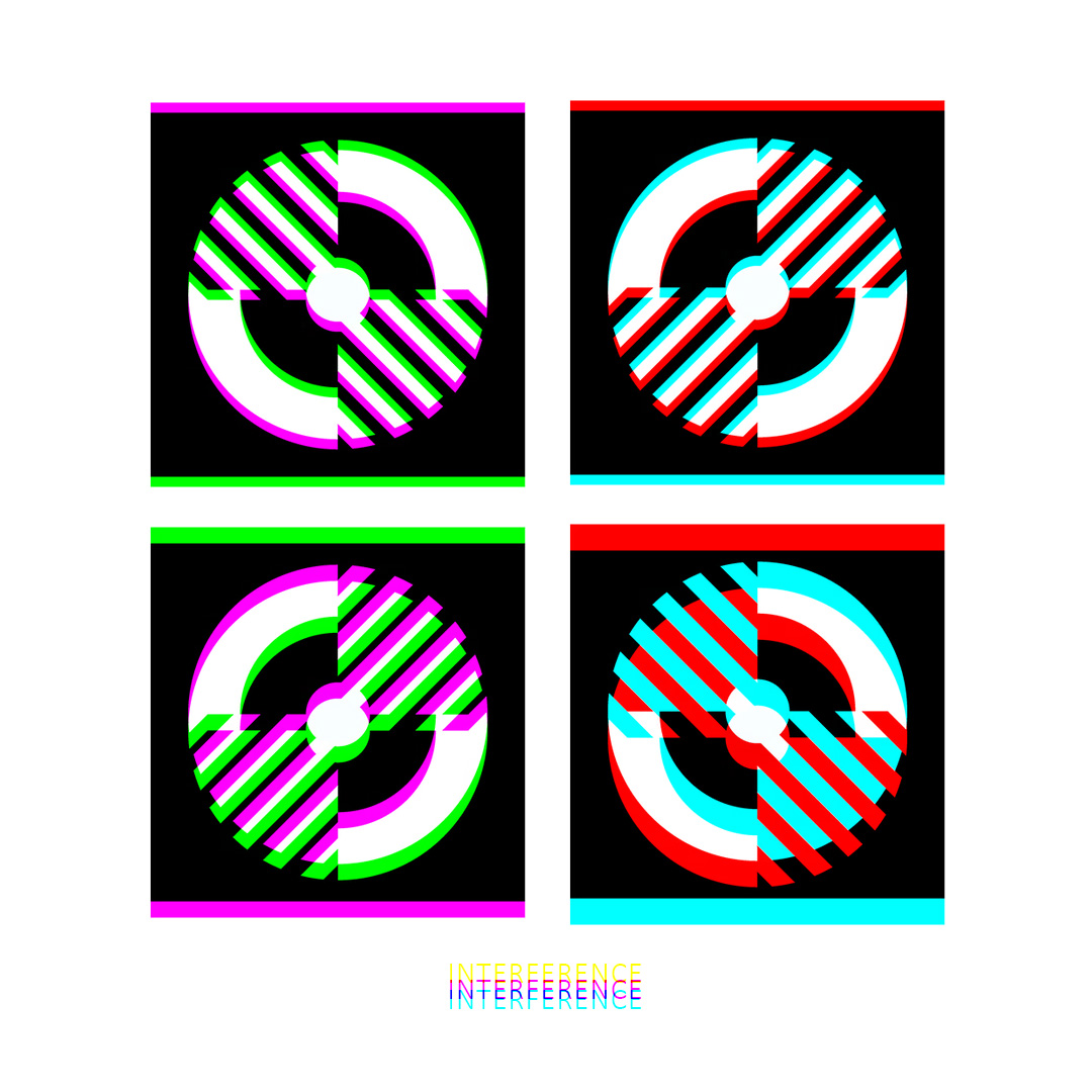
Interference is built from a simple, almost mechanical pattern: four square panels, each centred on the same circular “dial” motif — a thick ring, a split core, and a striped wedge that cuts through the circle on an angle. The palette is deliberately tight: green and magenta in some panels, red and cyan in others, sitting on hard black-and-white geometry. It reads like clean signal graphics — sharp edges, high contrast, nothing accidental.
When viewed at the correct focal point and orientation through a prism, the whole thing stops behaving. Colours transform creating a secondary image state as shown below.
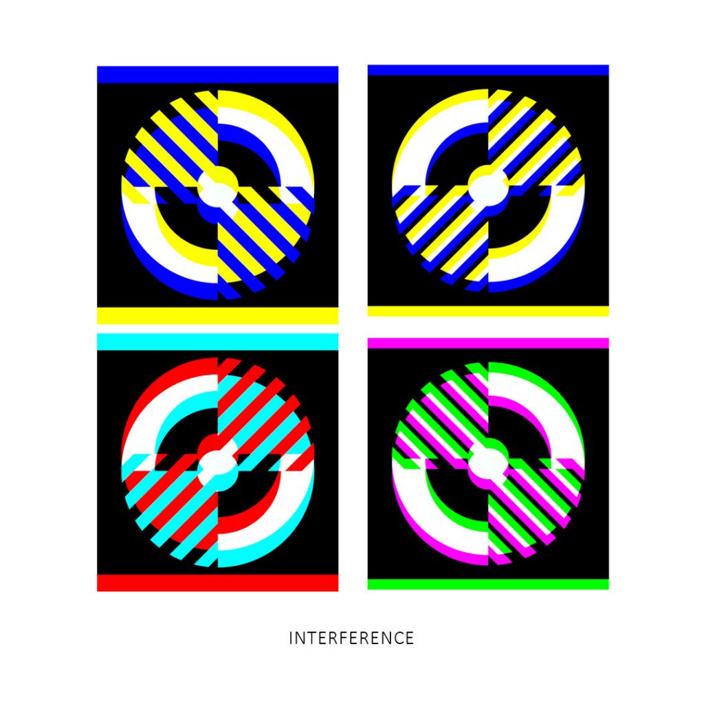
The first reaction is basically: what the heck is going on? The structure doesn’t change — the rings and stripes stay where they are — but the colours act like they’ve been re-assigned. The top row is a real mind-bender. The two blocks start from different colour pairings, yet both end up with the same colour shift to blue and yellow. You’re left staring at two panels that shouldn’t agree with each other, yet they converge — like two different routes arriving at the same colour destination.
The bottom panels feel like they trade identities: the magenta/green on the left shifts into cyan/red, and the red/cyan on the right scheme resolves into magenta/green. It’s not a fade or a filter. It’s more like the image has a second “state” that only appears when the channels are pulled apart and pushed back together.
That’s the interference at work.
A prism doesn’t just tint an image — it refracts the light. On a screen, every edge in this piece is really three edges stacked together: red, green, and blue subpixels. The prism nudges those channels out of alignment by slightly different amounts, so the “same” stripe is now three near-stripes, shifted. Where they overlap, they add; where they miss, they cancel. Black-and-white boundaries become mixing zones. Colours that were stable in the original — magenta (red+blue), cyan (green+blue), green, red — get re-composed by the new overlaps. Blue and yellow show up not because they were painted in, but because the prism forces new combinations and reveals what the eye normally averages out.
So the piece is a bit of a trick, but not a cheap one. It’s the same geometry, the same limited starting palette, and a completely different result the moment light is split and recombined. Clean, repeatable, and still impossible-looking — the kind of effect that makes you doubt your eyes for a moment.