the colours will be out of alignment. Some of the artwork I will be posting will have multiple focal points. The instructions for those may be slightly different than the instructions below.
Viewing Instructions
For best viewing, I recommend a right angle 90 degree triangular prism. I find it is easier to focus and gives a sharper image. An equilateral prism (60 degrees) can also be used, but it will distort the image more. Trying to focus with odd shaped prisms may give undesired results.
- Hold your prism close to your screen with the largest side of your prism flat against the screen. Hold it so that you can only see the image title in the bottom half of the prism. You should be viewing it like this:
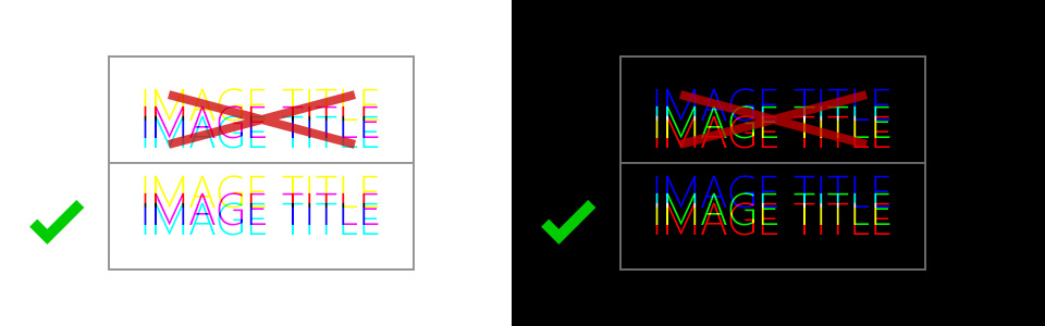
- It is typically easier to view the image and focus with just one eye, so close one eye and slowly pull the prism away from the screen, towards you while maintaining focus on the the image title in the bottom half of the prism.
- As you pull the prism towards you, you should notice the coloured letters start to converge to a point where they are all the same colour. Typically this will be black letters on a white back ground or white text on a black background as shown below. When the colours have merged together, you should see something like this:
- If you notice the colour starting to separate again you may have gone too far. I have a 27 inch monitor and view it at 1920px x 1080px, and it the focal point for me is about 25-26 inches.
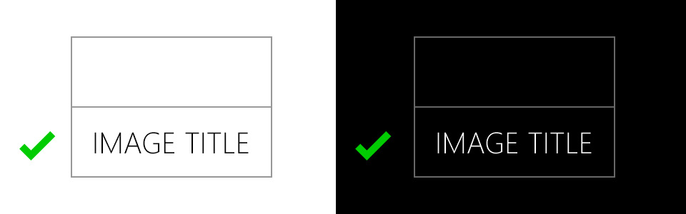
- When you find the focus for the image title, move your open eye towards the prism so that you can see the entire image in the bottom viewing area. Don’t move the prism closer to you or you may loose the focus.